Table Of Content
New in 2026
Quick Guide
Video Guides
Getting Started
UI Layout
Var Actor
Edit Scene
Designer
Other Features
Modes
Blueprints
Cost Tracking
Multi-Unit-Prj
Google Sheets
FAQ
Fix Bugs
Version History
UI Design And Settings
User Interface Design and Settings
Content:

User Interface Design
Main Menu PositionPlaces the Main Menu buttons on top or bottom of the screen.
Main Menu Data
The data table holding the design details for the menu. Double
Click to open.
TIP: use your own data table copy, so you can reuse the design in
other projects and don't loose it after an update.
UI Color Preset
Choose a color scheme from the list. The schemes can be modified in the Advanced section.
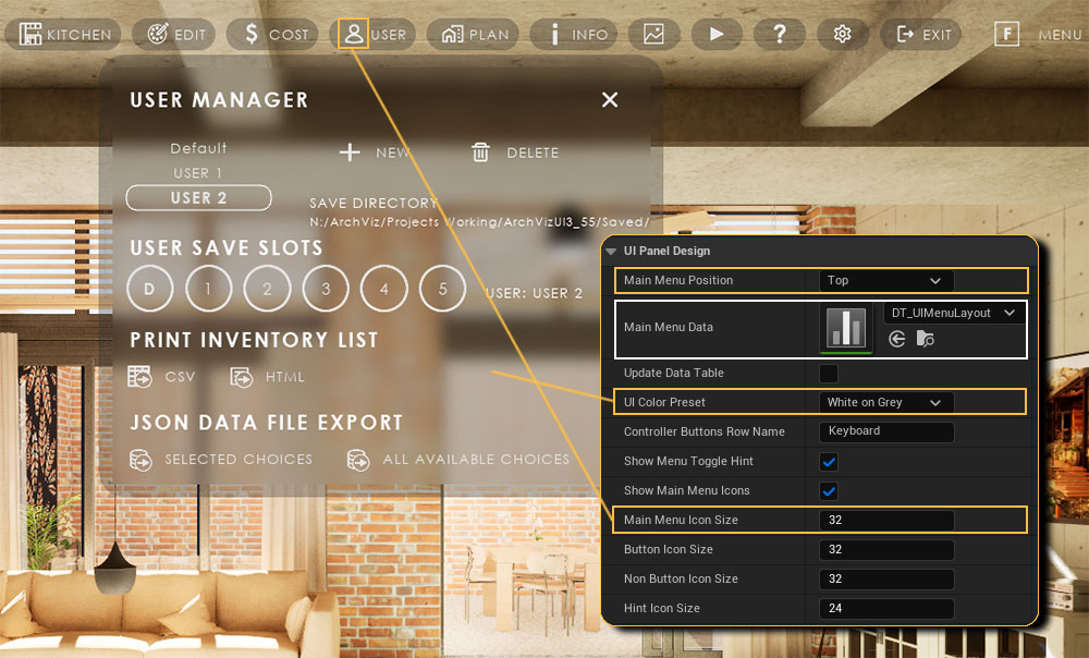
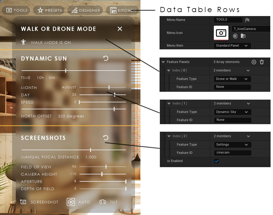
Every Row is a Main Menu button. The Row Name can be used as a reminder if the button has no Button Text.
Feature Panels
Every Index is a feature panel. Some features can be placed multiple times for a different purpose. They are then identified by the Feature ID.
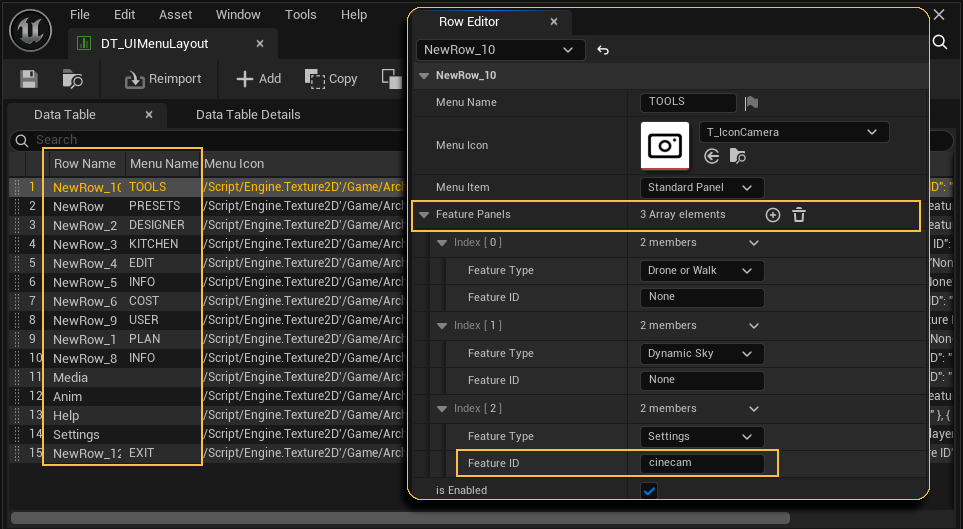
The first row in the data table is for the TOOLS menu. It has three elements added to the Feature Panels array
- DRONE AND WALK MODE is a Button Feature. Because it is commonly used it can be selected directly from the list of Feature Types.
- DYNAMIC SUN is a Settings Feature. It can also be selected directly as a Feature Type.
- SCREENSHOTS is a Settings Feature. It can be selected directly. In this case it is added as Settings with the Feature ID cinecam.
Feature ID
Feature IDs identify the feature if the feature type has multiple variations, like Settings has. Feature ID is the Row Name found in the data table assigned in the Settings section of the Info Map.
Text Format
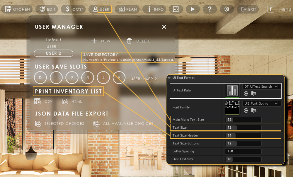
Main Menu Text SizeSize of the button text of the main menu.
TIP: Delete the text to only show the button icon
Text Size
Size of all text not formatted elsewhere
Text Size Header
Text size of the headers
Text and Translation
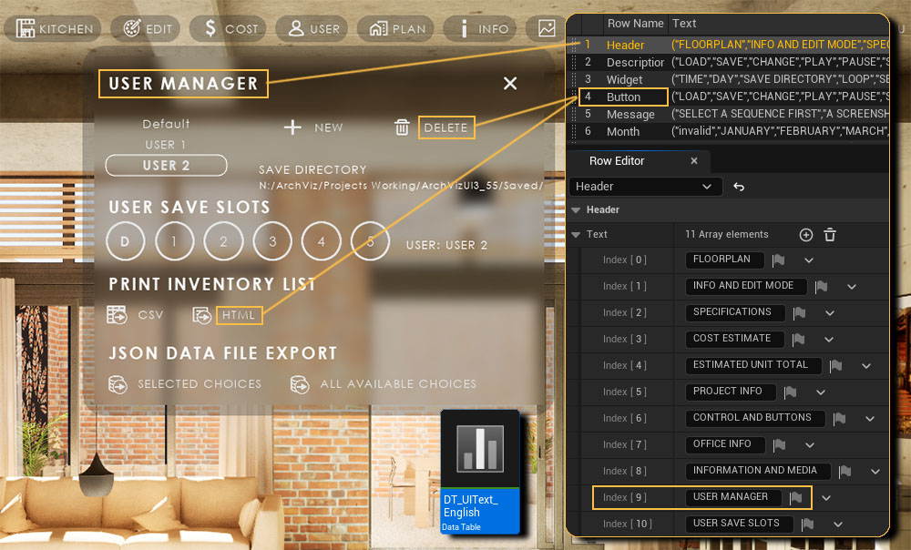
UI Text Data TableEach Row contains an array of text for the interface, covering all text used. It can be translated here without modifying the widgets.
- Header - the Feature Panel Headers
- Description - (will be removed but is still referenced)
- Widget - description text in widgets
- Button - description text for buttons
- Message - displayed in the bar below the menu
- Quality - for game settings
- Availability, Floor, Specs - for the Unit Info widget
TIP: Copy the English data table and translate it word by word to translate the UI. There is a German version but it isn't up to date yet.
 Top of page
 Documentation Archive 2025