Pages in Documentation

Settings

UI3 Overview

[old] Doors UE5
Quick Guide 2026

Quick Start
Swap Actor
Custom Assets
System Drawings
Guide 2022
Tips & FAQ
Guide 2024
Fix Bugs

FAQ

Cost Tracking
Modes
Other Features

Designer
Edit Scene
Var Actor
UI Layout
New in 2026
Multi-Unit-Prj
Google Sheets
Data Tables
Video Guides

Quick Videos
Designer

Cost Tracking
Widget Panels
Quick Guide
Scene Settings
Connect BP

VR projects
Version History
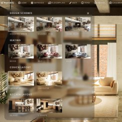
F. w. Preview
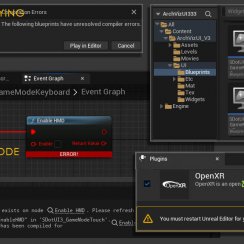
Fix Known Bugs
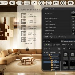
UI Settings
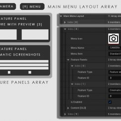
UI Layout
Gamemode
FAQ + TIPS
Quick Guide
V4 Functions 2
V4 Functions P1
V4 Quick Guide
Ver History
V3 Placements
V3 Mesh Def.
V3 Segments
V3 Quick Start
Books V2
Books V1
Customize
Quick Guide
Swap Actor
FAQ + TIPS
Doors UE4 (V1)

3.1 Bugs Fixes
Ver History
![[2 A] Generic Meshes On Spline Blueprint ../images/architecture/0023/v2-generic/thumbs/01.jpg](../images/architecture/0023/v2-generic/thumbs/01.jpg)
V2 Generic BP
![[2 B] Generic Spline Blueprint Examples ../images/architecture/0023/v2-examples/thumbs/01.jpg](../images/architecture/0023/v2-examples/thumbs/01.jpg)
V2 Examples
![[1] Railings Clone Blueprint Documentation ../images/architecture/0023/v1/thumbs/01.jpg](../images/architecture/0023/v1/thumbs/01.jpg)
V1 Railings Fences

UI 1 - Part 1
UI 1

Ui 1 - Part 2

1 Overview
UI2 Features
UI2 Get Started
UI2 Info Map
UI2 BP Actors
UI2 User Manager
UI2 FAQ
UI2 Tutorials

UI3 Overview
Getting Started

3.1 Info Map
Variation Actor
Blueprints
ArchViz Interface User Guide
A guide on how to implement the ArchViz user interface into your project.
This tutorial expects basic knowledge of unreal 4.

Content:
Preparing your Project
NOTE: if you use Google Chrome as a web browser the images in this user guide might be outdated. To get the latest images please switch to incognito mode and read the user guide there. Google doesn't check if the image has changed if the name is still the same.
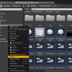
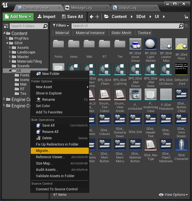
Open the project ArchVizUI and migrate the folder Content / ArchVizUI / UI to the Content folder of your new project where you want to use the interface. This will copy all necessary items.
If you want to use other assets like the furniture or materials that come with the ArchVizUI project then migrate the entire ArchVizUI folder instead.
Copy the file DefaultInput.ini from "ArchVizUI/Config" into your myproject/Config/" folder.
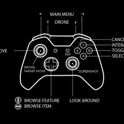
These are the input settings for controller and keyboard. if you cannot move around this file is most likely missing.
You have to enable global clip planes in the project settings if you want to use planar reflections for mirrors. To do so open the project settings, select Rendering and tick the box for 'Support global clip plane for Planar Reflections'.
Place a player start into your persistent level. Place a simple blocking volume under the player start and align it with the floor. This prevents the player from falling through the floor while the game streams in the sub-levels.
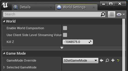
In the Game Mode section choose SDotGameMode from the list of GameMode Overrides.
Sometimes the SDotGameMode doesn't get migrated with the other files. If that happens just migrate it separately again.
The loading time will be a bit longer when you start the project for the first time. So always run the project at least once before showing it to the client. Even better: have a quick run through the project to load all assets.
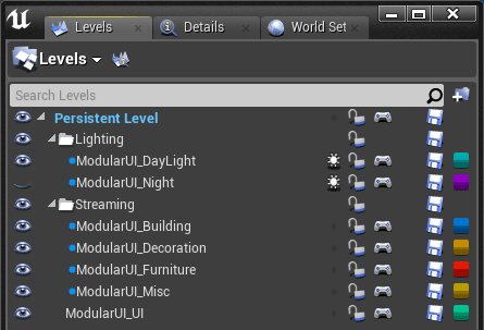
The BP_SDotLocatorMap needs to be in a level that has its streaming method set to "always loaded".
BP_SDotLocatorMap
To get started you need to have at least the building walls and floors placed inside unreal so you can align the floor plan.Drag the blueprint Content/ArchVizUI/UI/BP_SDot_Locatormap into the UI sub-level. This blueprint contains all settings for the look and features of the UI.
Floor Plan
Floors: Add one array element per building floor.
You will need black and white drawings of all floors for the player location tracking to work. I recommend a size of about 2000 px width or height. It doesn't have to be a power of 2
Any texture that is used in the UI needs to have the correct settings applied. Import the image then double click it to open the texture browser:
Check out the next section for a quick introduction on how to work with arrays.
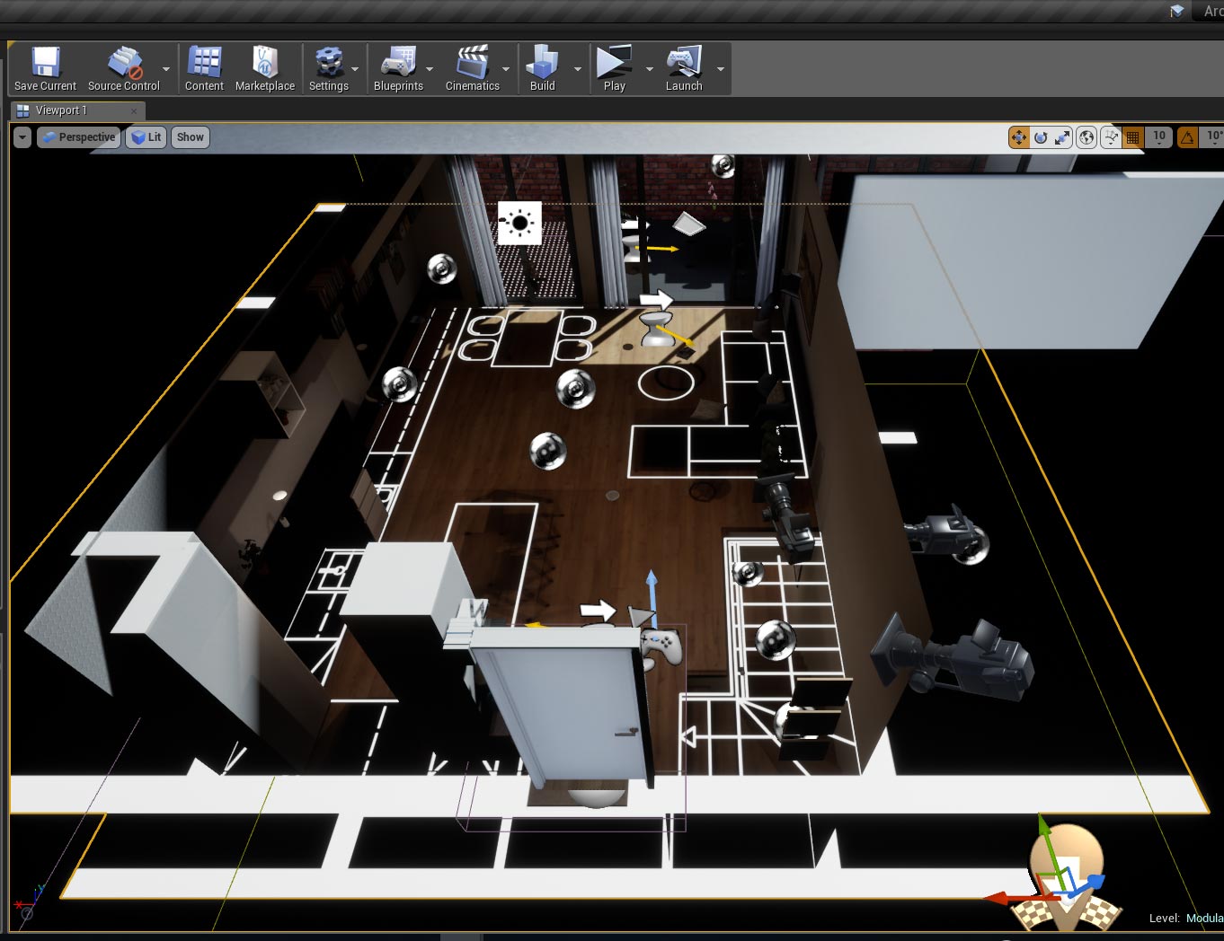
Once you added the drawings you will see it inside your level.
First use Floorplan Rotation to rotate the drawing and then use the transform gizmo to move and scale the drawing so it fits the building walls. Do NOT rotate the blueprint actor manually with the transform gizmo.
Location Groups help you organize the teleport locations. They can be either floor levels or other group names (eg: apartment 01, outside).
You need at least one location group.
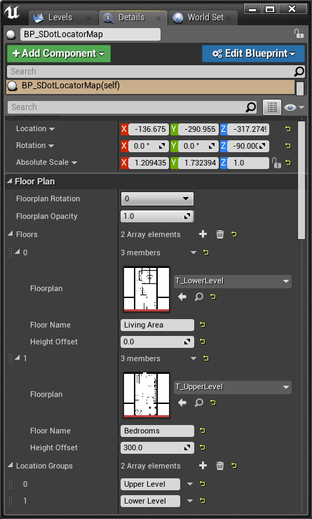
There are two floors. The blueprint actor is aligned to the lowest floor. The architectural drawings need to be placed with the same scale and position relative to each other. Think about Photoshop layers that would align perfectly when you make them slightly transparent.
Most architectural drawings will have the same scale by default so all you need to do is align them to each other.
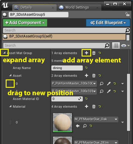
Working with arrays
A few tips on how to work with arrays:Arrays always start with index 0. There can be arrays within arrays. This might look a bit confusing when you are not used to work with them.
> 'Asset Mat Group' - master array
> '0' - master array element 1
. > Asset - sub array for master array 1
. '0' - asset 1
. '1' - asset 2
. > Material - sub array for master array
1
. '0' - Material 1
. '1' - Material 2
> '1' - master array element 2
. > Asset - sub array for master array 2
. '0' - asset 1
. '1' - asset 2
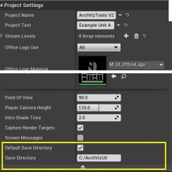
Project Settings
TIP: Right click on the level in the level browser to change its Streaming Method.
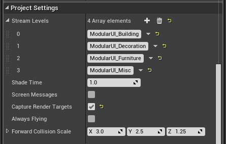
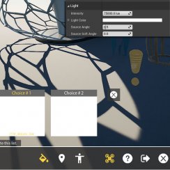
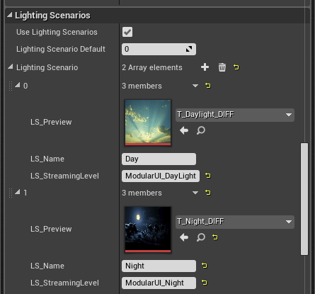
Lighting or Layout Scenarios
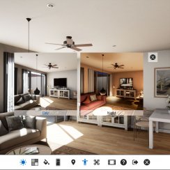
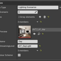
Scenarios are levels that contain all static lighting actors and build data. Using one of them with day and another one with night lighting for example lets you change from day to night light in a couple of seconds.Other uses can be furniture layout changes. This allows the furniture assets to remain static and improves the visual quality compared to dynamic furniture.
'Lighting Scenario': add one array element per scenario.
There are 3 generic preview images in the ArchVizUI/UI folder.
TIP: If you decide to only use one scenario level then add the level to the list of streaming levels in the Project Settings (further up). Then un-tick the box for 'Use Scenarios' to avoid having a feature with only one choice.
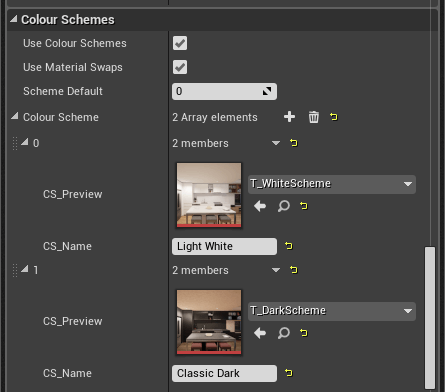
Color Schemes
Both Colour Schemes and Material Swaps use the same actors. A Colour Scheme will change all materials (actors) in the world at once while Material Swaps only change the selected object's material.Object Swaps allow the user to choose between different static meshes. Read more further down this tutorial.
'Colour Scheme': add an array element per scheme.
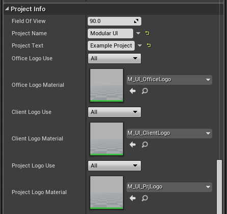
Project Info
UI Logos:
Add your own logo material. Best to copy the existing material and then just replace the texture. You can then add some features to the material. Only the parameters named 'Colour' and 'Background' will change with the UI colours. So leave them in the material.
The office and client logos will be displayed in the footer next to the client logo while the project logo will be displayed in the header next to the project name.
UI Design
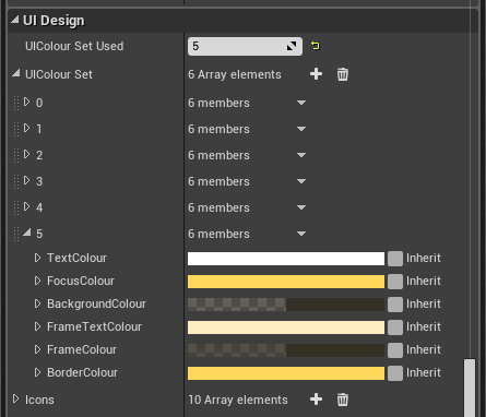
Here is where you set the colors of the UI design for the current project.UIColour Set
each array element represents a UI Colour set. You can choose from the 6 preset color sets or create a new one. You can also copy and paste one of the sets into a new array and modify it.
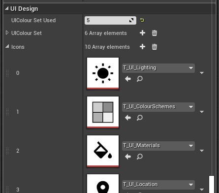
All main menu icons used in the UI are listed here. You can replace an icon with your own design or any of the spare ones in the UI/Icons folder. Sometimes it is useful to change the icons. If you use the scenario feature for layout scenarios then the sun icon would be inappropriate and should be something like the couch or the fridge instead.
The icon texture needs to be black on white (no alpha) and square.
This is purely cosmetic. Do not remove or add an icon and do not change the order of the icons here.
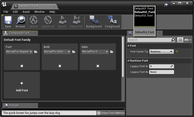
Make a backup copy before you start changing.
Double click the DefaultUI_Font in the content browser to open the font. Then replace the font styles inside this actor with the font of your choice. There are plenty of free fonts available that are supported by unreal.
IMPORTANT: Remember that renaming the DefaultUI_Font actor will actually create a reference to the new name in all the widgets. You have to update the actor itself to change the font. The name needs to stay as DefaultUI_Font.
Setting up Object Colors and Color Schemes
The blueprint actor BP_SDotAssetGroup is used to set up Colour Schemes and additional Material Swaps in the project.The first 2 or more materials are used for both swaps and schemes. Any additional materials will only be used for swaps.
Currently there is a maximum of 12 different materials that can be used in the list. Any more materials added will be ignored.
You do not have to add preview thumbs. These will be auto-created by the render stage. See further down for details.
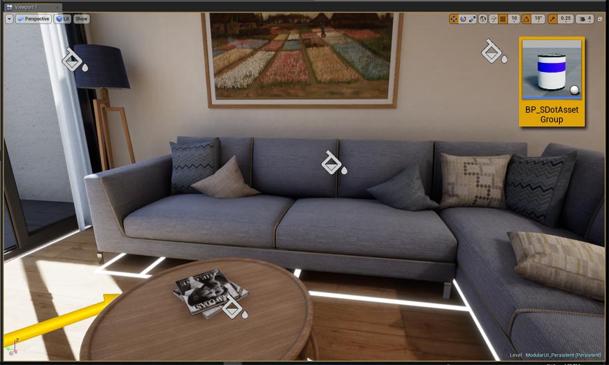
BP_SDotAssetGroup
Colour Scheme Materials
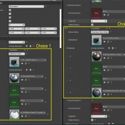
> Asset Material Group - Add asset groups here.
An 'Asset group' can be a single mesh or a group of meshes that will swap materials together. Let's say a couch set out of 3 elements. Now if you want the cushions on the couch swap their materials at the same time then just add another array element for them.
Another case would be that your assets have more than one material that need to be swapped. For example the fabric and the frame of a couch set. (Remember you can copy/paste array's members)
> Asset - Add an array element for each asset
eg. 3 array elements if you have 3 couch elements. Then click on the eye-dropper and "pick" the asset with the mouse from your levels.
> Material - the list of materials the user can swap to.
If "Colour Schemes" are enabled the first entries will be used for them. material [0] will be used for colour scheme [0] and so on. Any additional materials will only show up in the "Individual Material Swap" feature.
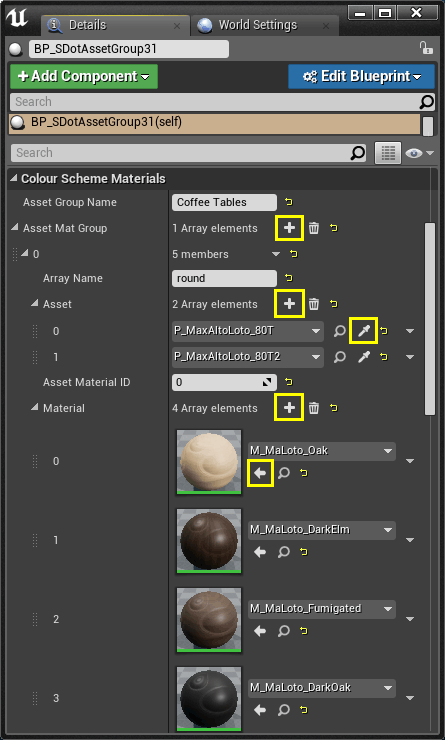
Use this only for materials like the shade of a lamp. I'll explain further down how to set up the material for this feature to work.

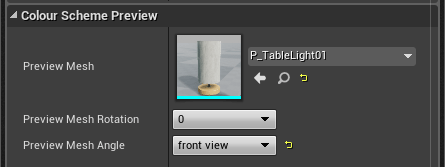
Colour Scheme Preview
Preview Mesh: Choose a mesh from the content browser to be used for the preview. This mesh will use the material from asset group array [0]. The mesh you use for the preview doesn't always need to be the mesh you actually use in the level.
Leave the default cube for tiling materials (like wallpaper or floor boards)
Material Setup for Lights
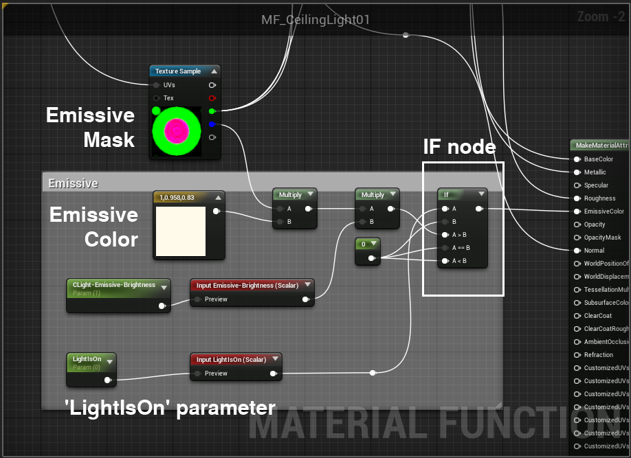
With the materials changing on an actor the material used for lights needs to be able to have an 'ON' and 'OFF' state of the material. Unreal doesn't support static switches in run time but you can use this little node setup as a work around.This uses an 'IF' node and a scalar parameter. If the parameter named LightIsOn is set to zero the emissive will be zero. Any positive value will enable the emissive and the light appears to be on.
The UI actor (light switcher or asset group) will set the parameter named 'LightIsOn' to '1' or '0' depending on the 'scenario tick box' being ticked or not.
Use EXACTLY the name 'LightIsOn' as shown in the image here. There are a few materials set up this way in the example project.
NOTE: the example shows the setup for a material function. Standard materials won't need the 2 red input nodes.
BP_SDotLightMarker
This actor is a simplified version of the BP_SDotAssetGroup. You can use it if all color schemes have the same material but the lighting screnario requires the light to have an on and off state.It works the same way as the SDotAssetGroup without the material array.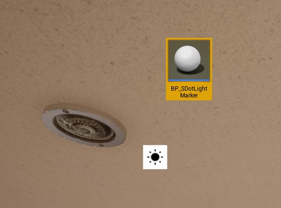
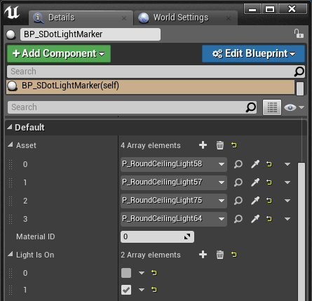
BP_SDotAssetMarker (legacy)
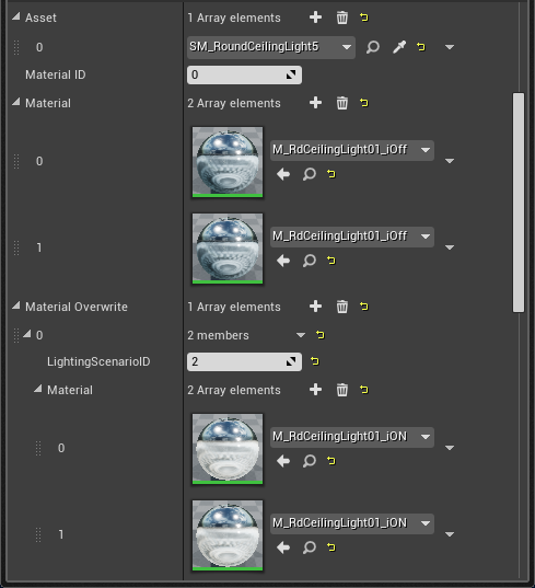
This is a legacy actor that has been replaced by the AssetGroup and the LightMarker. It can be used to overwrite materials depending on the current active lighting scenario.It is like the BP_SDotAssetGroup but it has only one group array. Instead of the lighting tick-boxes it has an overwrite feature for changing materials per lighting scenario.
You can use this blueprint actor if you have an emissive material that doesn't have the above mentioned 'LightIsOn' parameter node set up.
Add static meshes and materials the same way as for the asset group actor.
Material Overwrite
Material - You need to add a material for each Colour Scheme even if they are all the same.
In this example the ceiling light should be emissive when lighting scenario [2] is active. This means for both color schemes the light's material should be overridden with the 'ON' version for LightingScenarioID [2].
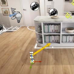
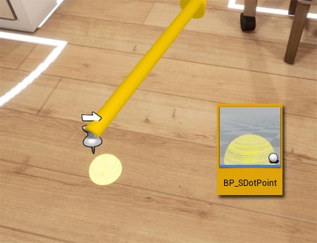
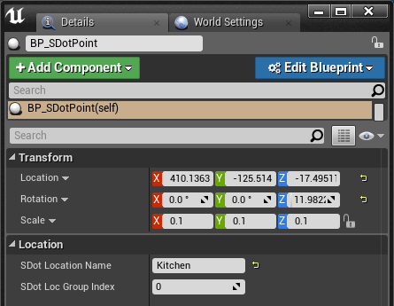
BP_SDotPoint
The BP_SDotPoint actor adds an entry to the list of teleport locations in the UI. It has only two parameters:Location groups are set up in the BP_SDotLocatorMap blueprint. See above.
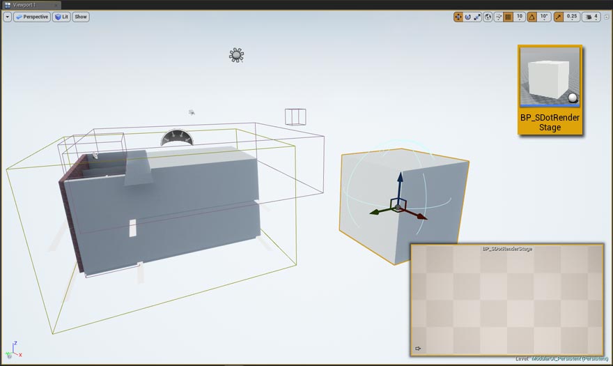
BP_SDotRenderStage
The render stage will auto-create preview thumbs for the Swap Materials feature. Place the actor into your level if you are using this feature.The render stage has no settings. it will render up to 12 preview images using the render to texture feature. It will do so every time the user switches to another asset group. It will take the preview mesh and materials from the active asset group and render the previews. The UI will then display the preview thumbs.
Place the render stage somewhere far enough away from the playable area. It contains dynamic lights that would otherwise interfere with your level lighting.
NOTE: if the previews have strange artifacts while playing the project check your fog or LUT settings or any related post process settings.
You may need to extend or place a post process volume around the render stage if the thumbs look a lot different then the scene.
 Top of page
 Unreal Documentation