Pages in Documentation

Settings

UI3 Overview

[old] Doors UE5

Quick Start
Swap Actor
Custom Assets
System Drawings
Step by Step
Tips & FAQ
Settings
CSV Export
Data Tables
Video Guides

Quick Videos
Designer
Cost Tracking
Widget Panels

Quick Guide
Scene Settings
Connect BP
VR projects
Version History
F. w. Preview
Fix Known Bugs
UI Settings
UI Layout
Gamemode
FAQ + TIPS
V4 Functions 2
V4 Functions P1
V4 Quick Guide
Ver History
V3 Placements
V3 Mesh Def.
V3 Segments
V3 Quick Start
Books V2
Books V1
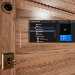
Customize
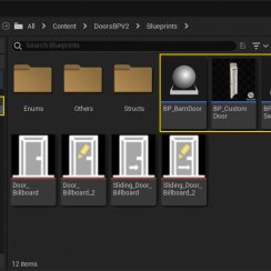
Quick Guide
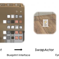
Swap Actor
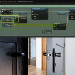
FAQ + TIPS
Doors UE4 (V1)

3.1 Bugs Fixes
Ver History
![[2 A] Generic Meshes On Spline Blueprint ../images/architecture/0023/v2-generic/thumbs/01.jpg](../images/architecture/0023/v2-generic/thumbs/01.jpg)
V2 Generic BP
![[2 B] Generic Spline Blueprint Examples ../images/architecture/0023/v2-examples/thumbs/01.jpg](../images/architecture/0023/v2-examples/thumbs/01.jpg)
V2 Examples
![[1] Railings Clone Blueprint Documentation ../images/architecture/0023/v1/thumbs/01.jpg](../images/architecture/0023/v1/thumbs/01.jpg)
V1 Railings Fences

UI 1 - Part 1
UI 1

Ui 1 - Part 2

1 Overview
UI2 Features
UI2 Get Started
UI2 Info Map
UI2 BP Actors
UI2 User Manager
UI2 FAQ
UI2 Tutorials

UI3 Overview
Getting Started

3.1 Info Map
Variation Actor
Blueprints
UI3 Info Map
The Info Map is where all your project data lives. Place one into your level. The UI will not work without an UI3 Info Map. Select the blueprint in the scene and enter all data as described below.
Do not change the blueprint itself in the content browser unless you permanently want to alter the design, or functionality, and you know what you are doing.
Content:
Adding the Info Map
Place the info map into a non streaming level.You can put a floor plan into it for a reference when assembling the scene. The floor plan needs to be black on white background.
Rotate the floorplan with the standard transform Z-rotation to align it with the walls. Then use the scale value in the Floorplan Settings to scale it. Finally move it so it matches the walls as exactly as possible while fine tuning the scale value.
Transform
| > Transform | |
| Location | Move the floorplan or change the location values here. |
| Rotation | Rotate the floorplan or change the Z values here. Only Z can be something else than 0.0 preferable between 0 and 360 |
| Absolute Scale | You can't change the scale values here.
The blueprint will calculate the side ratio of the floorplan texture. The overall scale can be set in the Floorplan settings section. |

Project Settings
| > Project Settings | |
| > Stream Levels | Add the name of all your levels here that need to be streamed in. Don't add the scenario levels or levels that are set to be always loaded. |
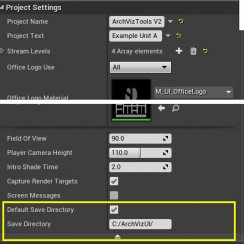
| Project Name | The name of the project will be displayed in the Info widget |
| Project Text | An additional punch line for the project name |
| Unit ID | This is an internal number that allows different save slots for multiple units. A new number will generate 5 new save slots. |
| Use Mouse Move | Activate mouse move. This will display a target under the mouse cursor on any floor or defined stair mesh. Clicking the left mouse button will move the player to the target. |
| > advanced display | |
| Screen Messages | untick this to hide debug messages on screen during play. They will still appear in the output log. |

UI Design
| > UI Design | |
| UIColor Set Used | The ID of the UIColors set that will be used for this scene's UI. See below. |
| Main Menu Text Size | The size of the text used in the main menu buttons. |
| Main Menu Icon Size | The size of the icons used in the main menu buttons |
| Icon Button Size | The size of icons used within the sub menus. |
| > Advanced | |
| > UIColors | Each array defines a set of colors and
translucency (alpha) used in the UI. Choose above which set to use. - Text: all standard text - Background: background of the sub menus - TopText, Focus, Background: the top menu with the main menu items - Frame: button and other frames. Set alpha to 0.0 to remove frames - FrameFocus: frames that are in focus - ThumbFrameFocus: image previews frames that are in focus - FrameActive: frames around active items - Slider: unfocused sliders. Sliders in focus will use the Text color. |
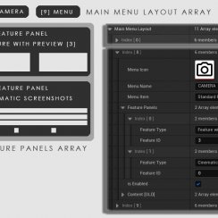
| Main Menu Text | The text that is used for the main menu buttons. You cannot change the order of the buttons here. |
| Show Main Menu Icons | when ticked all icons show in the main menu buttons. If unticked only buttons without text will show the icon. |
| Main Menu Icons | You can replace icons here. You cannot change the order of the icons here. Your icons need to be square and the type needs to be set to 'User Interface' in the texture viewer. They also need to be black on white to use the coloring logic of the UI. |
| Button Text | This is a collection of all test used for buttons in the UI. This is useful to enter text in a different language. You can only replace one for one. Do not reorder, remove or add array elements. You can copy / paste the array between projects. |
| Preview Size | The preview image size for Scenarios, Design Schemes, Sequences and Worlds. Changing these values can have unexpected results. The UI is designed to hold 3 full images of this size horizontal. More than 3 items will spawn a horizontal scroll bar.. |
| Box Image | The Border Image that creates the round corners for some widgets. |
| Blur Strength | The strength of the background blur. |
| Slot Saved | The color of a slot that has been saved and contains data. |
| Save Slots | The color of the ring around the save slot button when in focus. |
| Icon A B X | Icon images for the controller used. These can be replaced with other icons if a different controller is used. There are icons available in the UI/Tex director for HTC VIVE and Oculus touch controllers. |

Scene Presets
| > Scene Presets | |
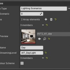
| Enable Scenarios | A scenario is a sub level that can be
swapped out with another scenario level. For example 2 completely
different furniture arrangements or a daylight and a night setup as
seen in the example project. A level can hold the entire lighting data if it is set to a Lighting Scenario in the level browser. (It actually doesn't need to have a light in it to do so) |
| Default Scenario | The ID of the scenario level that is loaded by default. |
| > Scenarios | Add an array element for each Scenario level here. |
| Scenario Preview | An image based on 1920x1080 px ratio. Needs to be at least 250x140 px. |
| Scenario Name | A short name displayed under the preview image. |
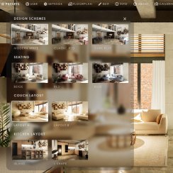
| Enable Design Schemes | A Design Scheme is a set of material and mesh choices that can be changed with one click. It uses the standard variations blueprint. The first entry in the blueprint will be used for Design ID 0, the 2nd for Design ID 1. |
| Note | [Bug] Tick Scene Tools -> Enable World Travel if the list of Design Schemes is missing. The Worlds Travel menu will still not be visible if the Worlds array is empty. |
| Default Scheme | The Design Scheme loaded by default. |
| > Design Schemes | Add an array element for each Design Scheme here. |
| Design Preview | An image based on 1920x1080 px ratio. Needs to be at least 250x140 px. |
| Design Name | A short name displayed under the preview image. |
| Enable User Saves | If enabled a row of 5 save and load icons is displayed in the UI. |
| > advanced display | |
| Save Slot Size | The size of the ring texture used for the save slots. Increase to around 90 for touch screen controls. |

Scene Tools
| > Scene Tools | |
| Enable Movable Sun | When ticked the UI3 will look for a Sun Positioning Actor / Sun and Sky Actor. If one can be found it will use it to change the position of the sun according to the sliders of the menu. You can enter the exact location into the Positioning Actor directly. |
| Solar Time | The default solar time where 13.5 is 1.30 pm |
| Day | The day of the month |
| Month | The month to get the correct sun angle |
| Enable Sequence Player | The Sequence Player can play sequences present in the scene. This is not a pre recorded movie. It will play the sequence in real time and any changes made to the scene will be visible in the sequence. |
| > Sequencees | Add an array element for each Sequence here. |
| Sequence Preview | An image based on 1920x1080 px ratio. Needs to be at least 250x140 px. |
| Sequence Name | A short name displayed under the preview image. |
| Sequence | Add a valid sequence here. |
| Enable World Travel | World Travel means loading a different scene. The new scene will need its own Info Map and you need to enter all data into it. If you want to come back here you need to enter the current persistent level as a World to travel back to. |
| Travel Header Text | Enter a name if you don't like the default name. |
| > Worlds | Add an array element for each World here. |
| World Preview Image | An image based on 1920x1080 px ratio. Needs to be at least 250x140 px. |
| World Name | A short name displayed under the preview image. |
| World Name Short | A shorter name - currently not used. |
| World Persistent Level | Enter the exact name of the world's persistent level here. |
| Screenshot Resolution | Enter the resolution for screenshots here. It can be in pixels like 1920x1080 or as a multiplyer of the current screen size (1 or 2, etc) |
| Enable Inventory List | You can print an inventory list if you have the Easy File Manager plug-in available on the Marketplace. See more detail in the FAQ and Tips section. Click the tick box to enable the buttons here. |
| > advanced display | |
| Use Default Save Directory | If true the save directory will be 'MyProject/Save/' with subdirectories for 'Screenshots' and 'List'. If not saves will be in the directory name below |
| Custom Save Directory | A custom save directory for screenshots and lists. Above tickbox needs to be unticked for this to work. |

Floorplan
| > Floorplan | |
| Show Floorplan | Weather to show the floorplan menu. |
| > Floors or Units | Add an array element for each Floor or Unit here. |
| Floorplan | This should be a black on white image
containing a simplified version of the design drawings provided by the
architect. You can have multiple stories on top of each other but all
floorplan need to match the relative position. A bit like a flip book.
The image needs to be uniformly scaled where the X side is scaled the same way as the Y side. |
| Floor Name | A short name displayed on top of the floorplan image. |
| Height Offset | The lowest floor should have an offset of 0.0. Enter the floors as they are located in the building from lowest to highest. The offset is the total offset from the lowest floor. |
| Floorplan Scale | Use this value to scale the floor uniformly. |
| > Rooms for List | Add an array element for each Room here. |
| ID 0, 1, 2 ... | Add the names of rooms here. You can asign Variation Actors to the room ID to make lists more readable. |
| > advanced display | |
| Fade Black Teleport | If ticked the screen fades to black for the teleport to a new location. |
| Tele Slide Time | The time it takes to move the player to the new location. |
| Dot Size | The size of the interactive dot created for each location found in the scene. Increase to around 32 for touch screen controls. |
| Ratio | [Read Only] Displayes the ratio of the floorplan image for debugging. |

| > Info Media | |
| Show Info Media | Weather to display the Info menu. |
| > Info Media | Add an array element for information you want to display in the Info menu. |
| Name | A short name for the button. |
| Image | An image to be displayed when the button is pressed. Use a black and white image to integrate with the UI color scheme. The first entry here is the control scheme help by default. |
| UIGraphic | Untick this if you want the white background of an image to remain white. Otherwise it will be treated as UI graphic. |
| Media Source | Add an Unreal Media Source object here to display a movie. This will override any image entered. |
| Description | A longer description for the movie or image displayed. |
| > advanced display | |
| Prj Info Text Size | The text size of the lines entered as Project Info Text |
| Max Size Images | Changing the size here might be useful for very large or small monitors. |

About
| > About | |
| Show About | Weather to display the About menu. |
| Prj Logo | A square image that is displayed on top of the Info menu. Needs to be black and white to integrate into the UI color scheme. |
| > Project Info Text | An array of lines displayed next to the project name in the Info menu. Meant to be used for address and phone number, etc. |
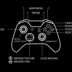
| Image Controls | Add an image here to explain the controls. There are images available in the Tex folder. Or create your own image. |
| > Logos | Add an array of logos here. They need to have a 2:1 side ratio (256x128 px or larger). If they are black and white they are integrated into the UI color scheme. |

Player Settings
| > Player Settings | |
| Show Settings | Weather to show the settings menu or not. |
| Turn Rate | The turn rate for mouse controls for the player camera. |
| > advanced display | |
| Max View Angle Up | Restricts the angle the player can look up |
| Max View Angle Down | Restricts the angle the player can look down |
| Slider Time Delta | Time to repeat controler input when you keep holding down the button. |
| Slider Value Delta | Amount the will be added per step. |

Player Movement Settings
| > Player Movement | |
| Walking Speed |
Default value for player walking speed. |
| Max Can Step On Height | This value determins what height the player can step on. 30 units is high enough for steps but stops the player from stepping onto furniture. |
| Flying Min Speed | The speed the player starts moving in drone mode. The speed will increase until the max speed is reached. |
| Flying Max Speed | The maximum speed for the drone to fly. |
| > advanced display | |
| Flying Acceleration | The amount the flying increases when holding down the movement button or key. |
| Flying Deceleration | The amount the drone will decrease speed when letting go of the button or key. |
| Drone Speed UpDown Factor | Reduces the speed for flying up or down with the drone by this factor. The drone won't accelerate up or down. Can be larger than 1.0 to increase speed. |
| Target Move Time | The time the player takes to move to the target on the floor when clicked. 'Target Move' needs to be enabled. |
| Target Life Time | The time the target stays alive in the same spot. You can increase this value if the move target is barely visible for performance reasons. |
| Target Material | The material that creates the floor target for target move. Needs to be a Defered Decal. |

Edit Objects (Variations)
| > Edit Objects | |
| Allow Object Edits | Weather the Edit Objects menu will be displayed. |
| Marker Visibility | All = Show all markers Selected = Only show the selected marker None = Never show the markers |
| Marker Scale | Size of the markers. |

Camera Settings
| > Camera Settings | |
| Field Of View | The default FOV. Can be changed in the Settings Menu. |
| Player Camera Height | The default camera height. 110.0 feels like a good value. Can be changed in the Settings Menu. |
| Max Focal Distance | The maximum value for the manual focal slider. Lower values will increase acuracy for close up shots. |
| Default Aperture | The default aparture set for the camera |
| DOF Radius | This doesn't have any visible effect at the moment. Leave it at default value. |
| Orbital Camera | True will enable the camera beam to be modified with the mouse wheel and apply the Arm Length set below as default. |
| Orb Cam Angle | The angle of the orbital camera. It will look slightly down at default. |
| Orb Cam Arm Length | The length of the camera arm. A value of 2000 cm will allow the user to rotate the camera around the player start. This can be useful for exterior scenes. This allows to rotate the view around the building. Place the player start above the building. The camera will still be blocked by collision. This isn't fully fleshed out yet. So use with care. |
| Orb Zoom Factor | How fast you can zoom with the mouse wheel. Higher values will increase the zoom speed. Middle mouse button will reset the arm to default length. |

 Top of page